Brand Identity · Logo Design · Visual Identity System · Web Design
AMANK
A connected brand identity for a company that brings medical services and logistics together: care in motion.
- Industry
- Healthcare & Medical Logistics
- Location
- Egypt
The project
AMANK brings medical services and logistics together in one coordinated ecosystem, built around trust, human care, precision and continuous movement.
The challenge was to speak to two worlds at once. Healthcare has to feel reassuring and human; logistics has to feel precise, organised and dependable. The identity needed to carry both without turning clinical or mechanical.
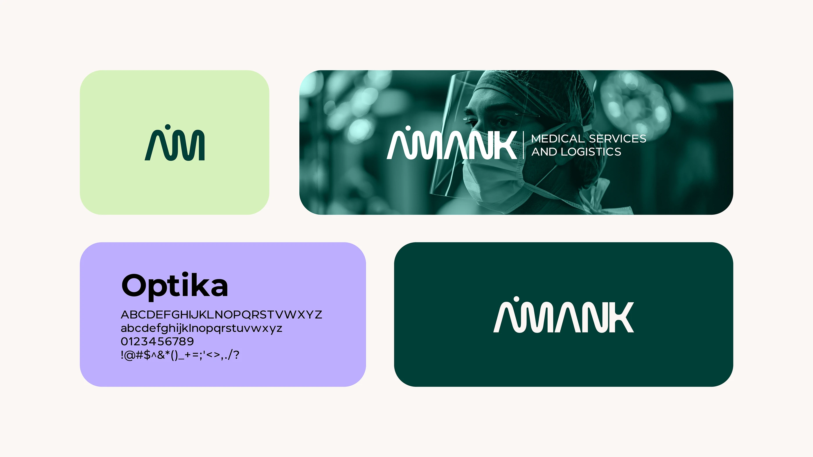
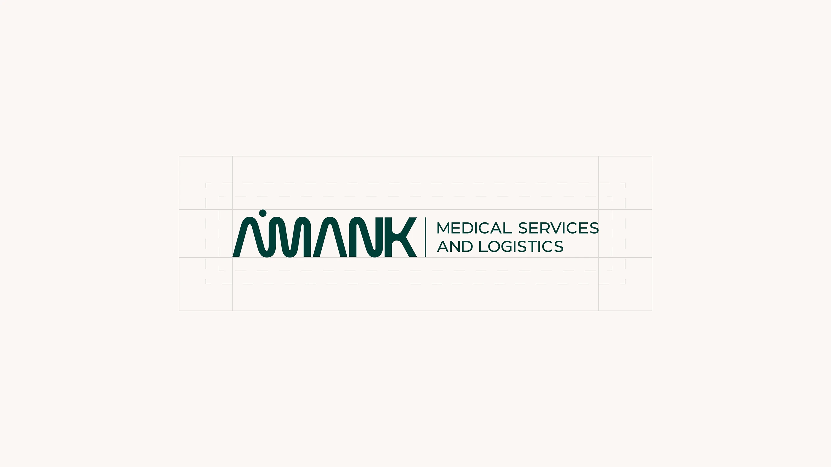
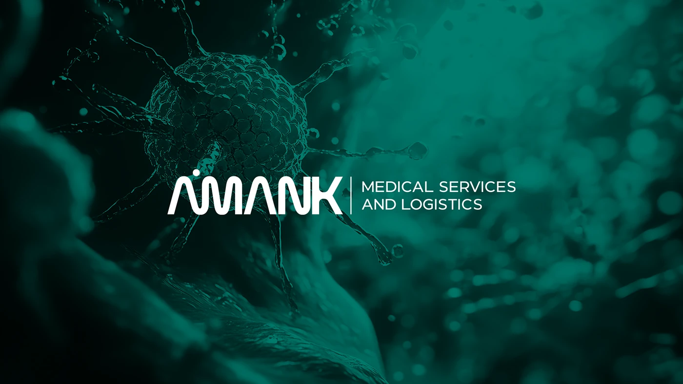
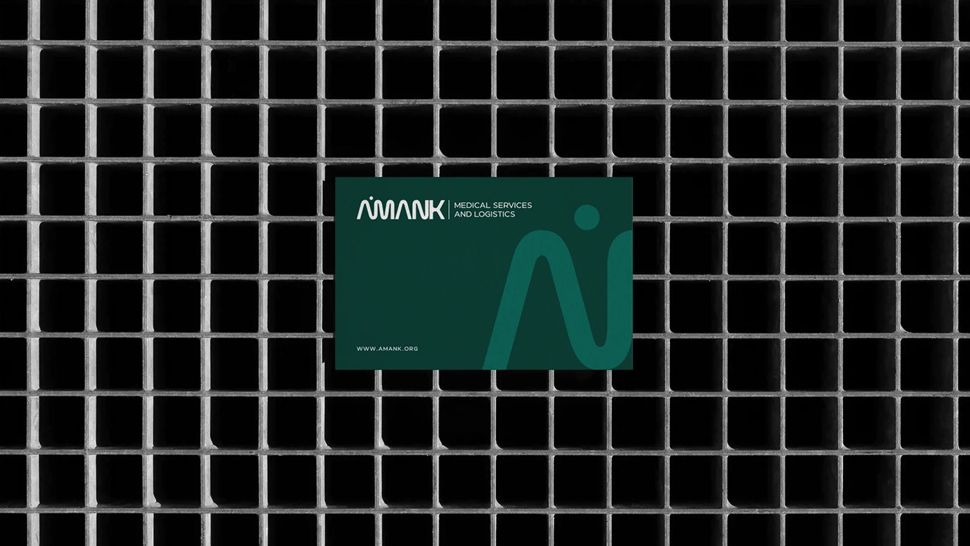
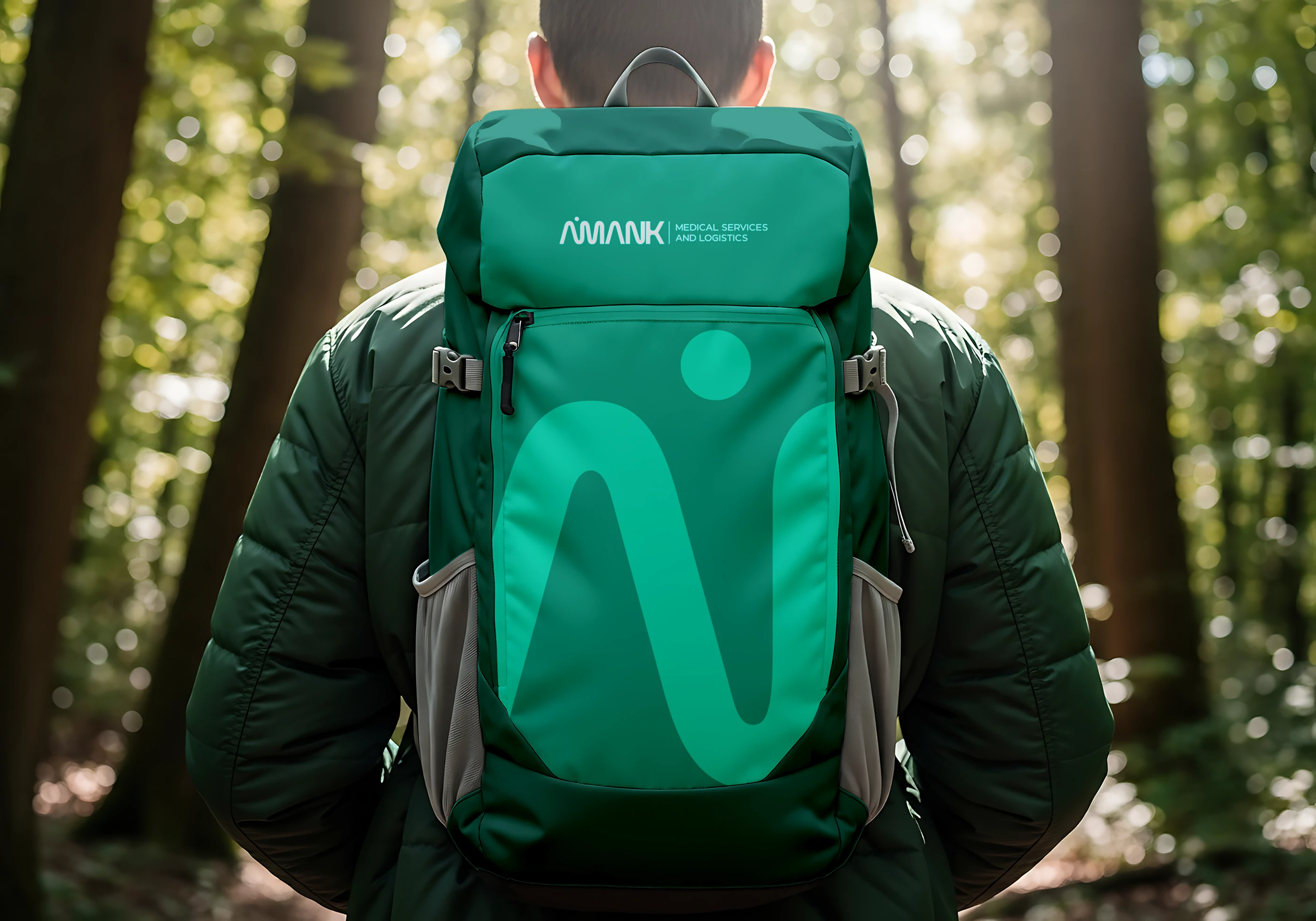
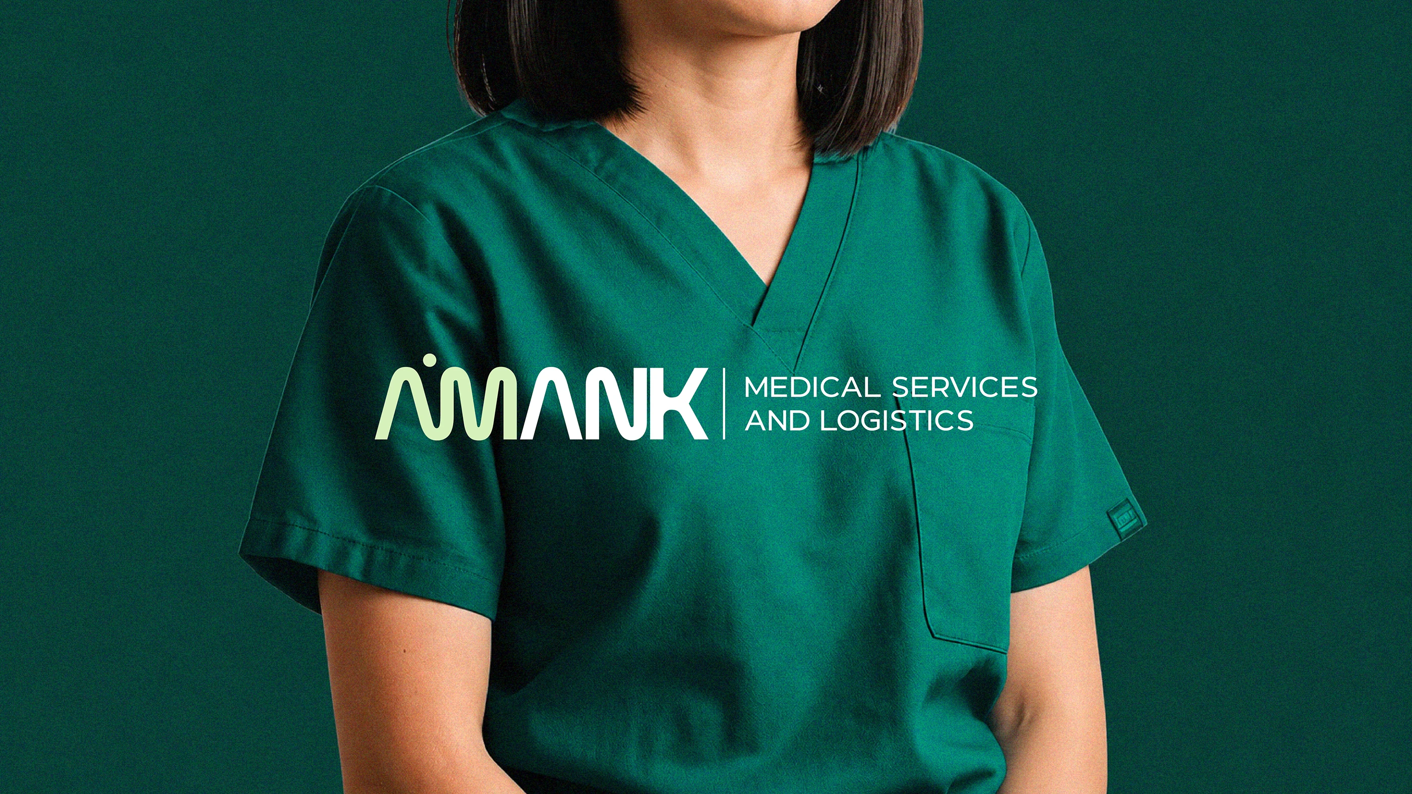
We built the brand on one idea, care in motion: healthcare as a continuous system where people, services, resources and destinations stay connected. The logo joins the letters A and M into a single flowing monogram, and its inner shapes suggest human figures, keeping people at the centre of the mark.
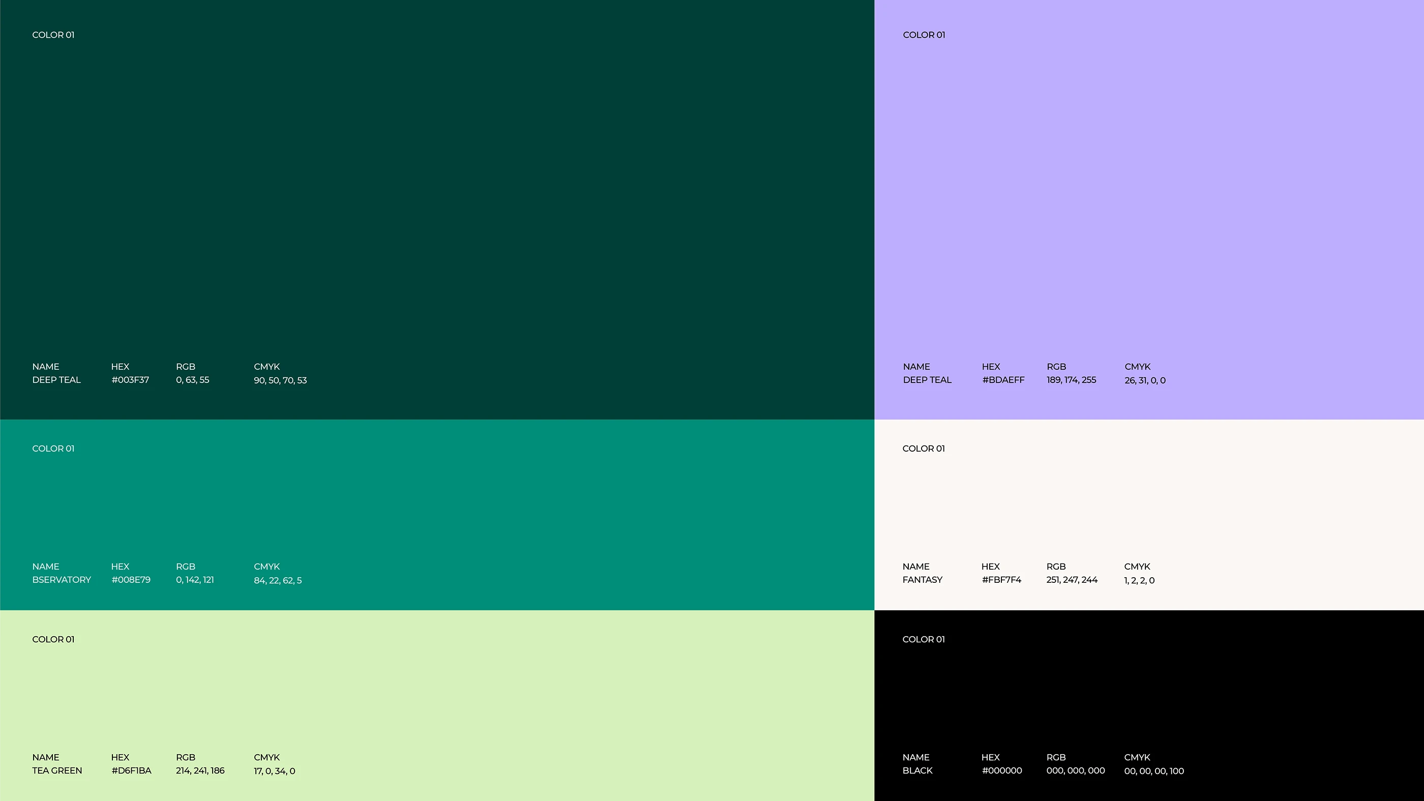
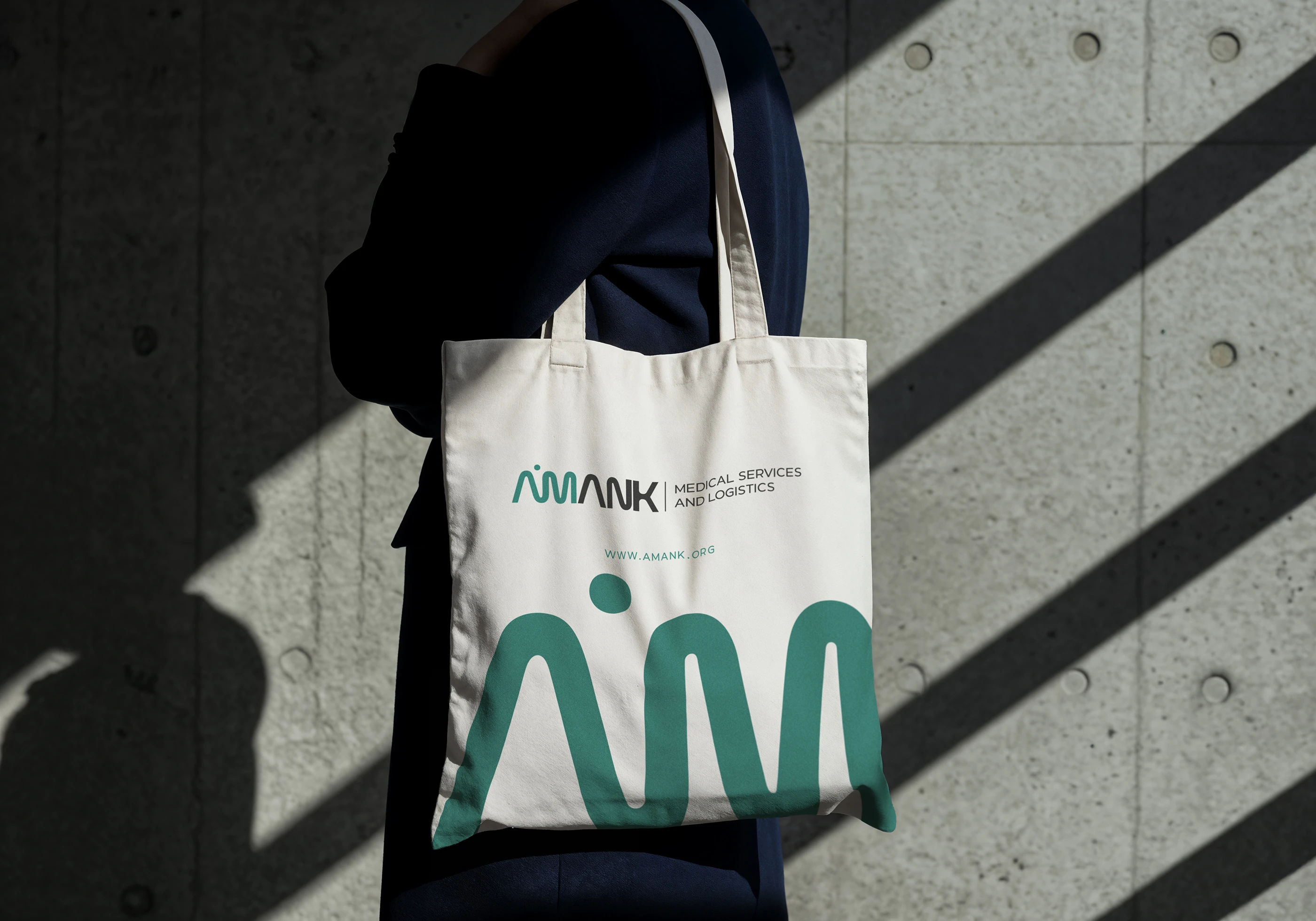
Confident greens sit beside softer supporting tones, so the palette feels professional and trustworthy without becoming cold. Clear typography with generous spacing keeps information easy to read, and curved forms taken from the logo give the visual language its sense of movement.
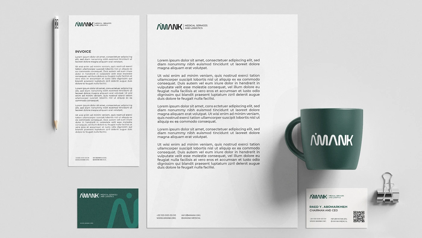
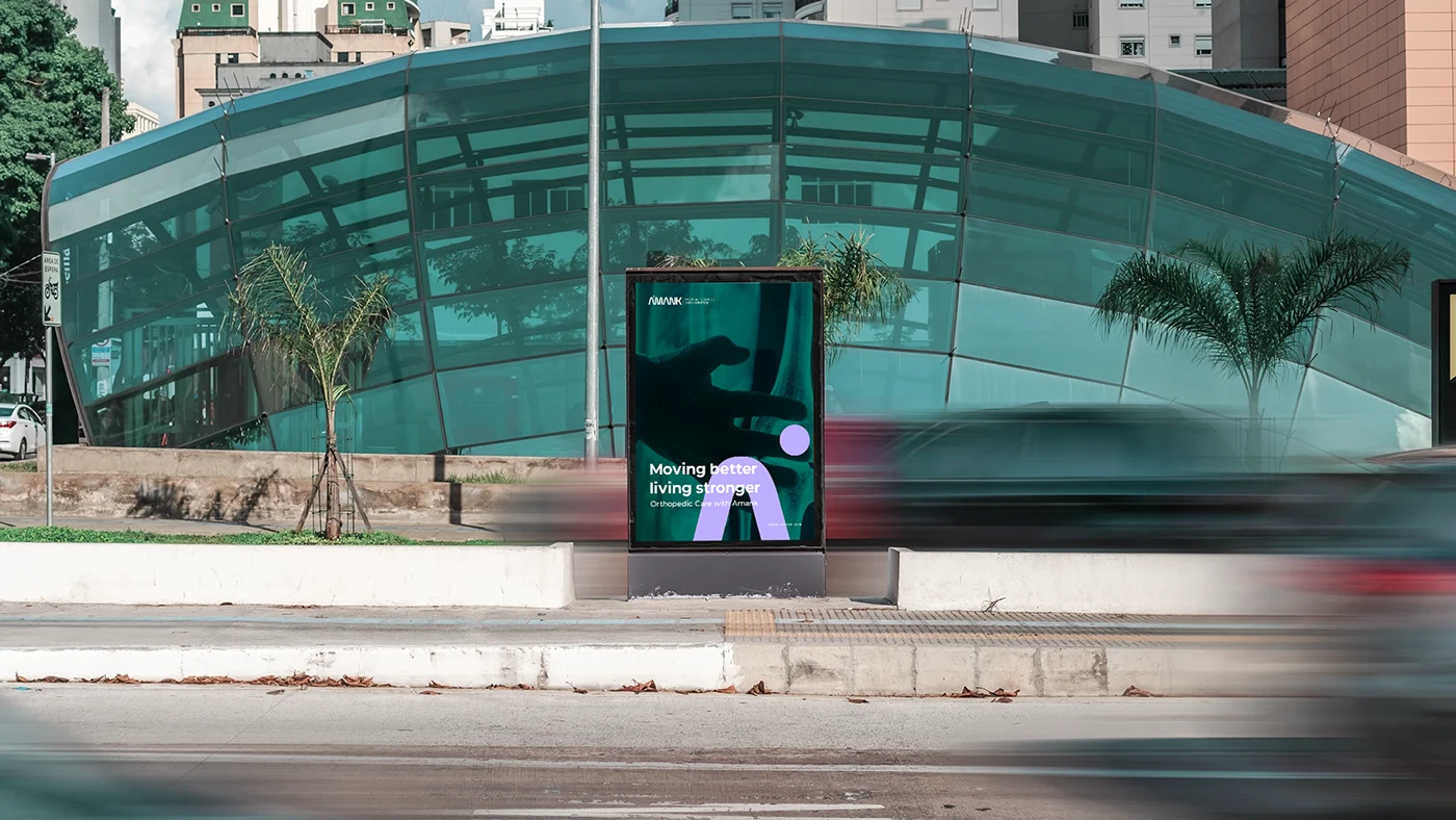
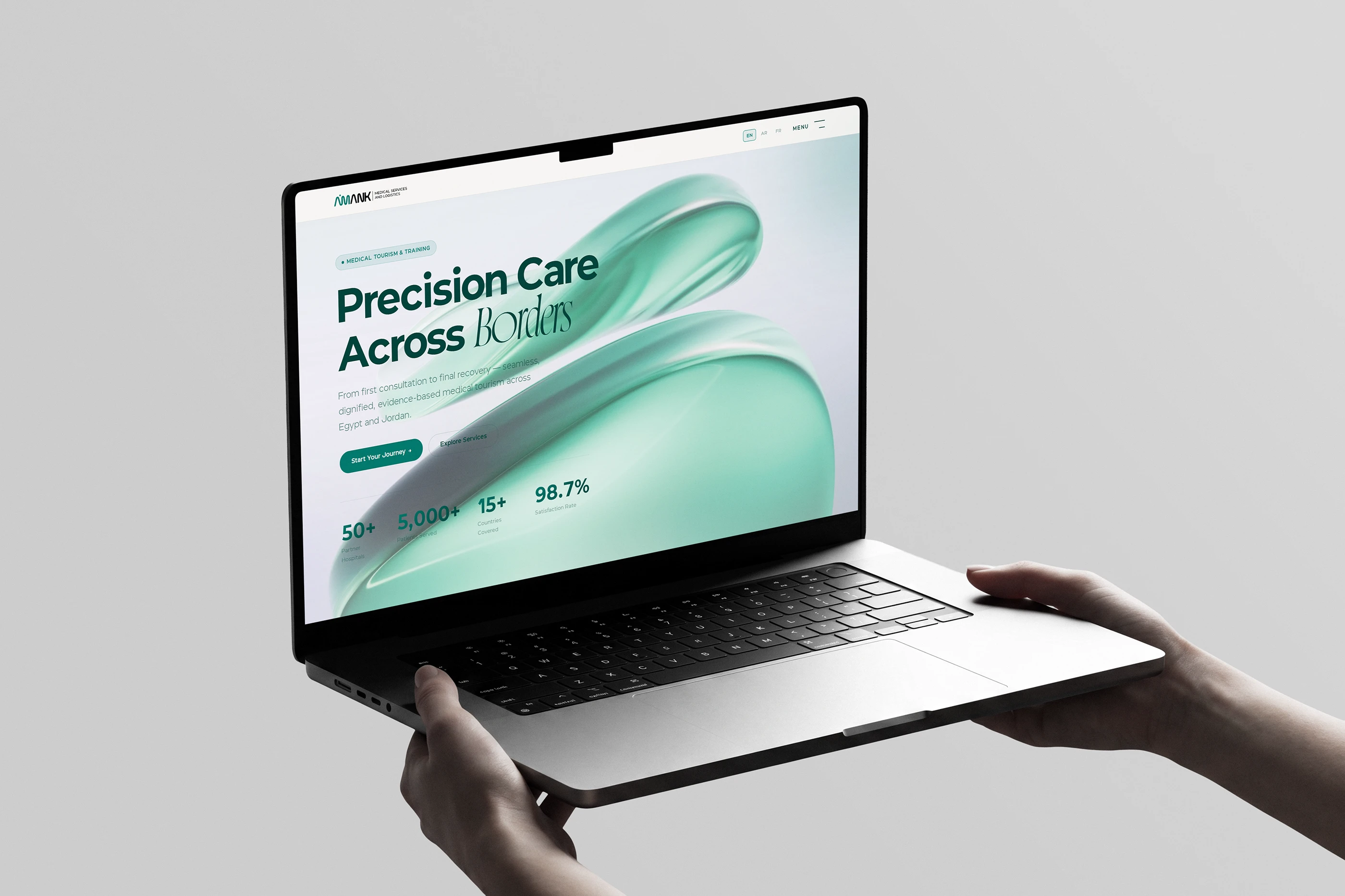
AMANK was designed as a complete system rather than a logo: uniforms, vehicles, packaging, stationery, digital platforms and environmental graphics all carry the same calm, connected look.